
Another new starships post within a week? Yes sir it is and this time were back on regular issues.

This time we're sticking close to the "early days" with both ships pre-Kirk. Starting us off is the iconic Phoenix from First Contact and a model that really should be one of the best in the collection hands down. It's one we've wanted, waited for and finally received but I'm a bit disappointed.
What? Yes, I'm disappointed because I genuinely don't think this is up to the standard I was expecting but let's talk about the package as a whole and not just my gripes.
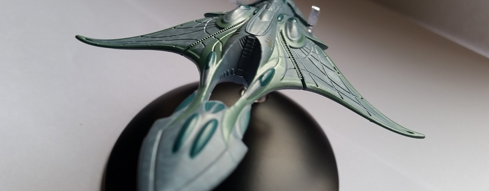
Firmly gripped amidships by the stand, the Phoenix is very light and well-balanced for display, modelled with the warp engines deployed as though about to take her momentous flight. The hull is in keeping with the "salvaged" vision of the movie missile with its surface wrapped with indents and raised sections of metalwork seemingly on every facet and displaying a wonderfully haphazard patchwork effect. Starting at the nose, the bubble windows are painted straight onto the hull in black making them one of the few things that isn't on point and seems out of place against the rest of the bumpy hull detail.

The great bit about the Phoenix is just how much there is packed onto the silvery-metallic hull and likely makes it one of the most accurate ships in the collection as far as panelling goes. That extends all the way down to the super-impressive rocket engine construction at the end/bottom of the Titan V missile. In both the upper plastic and lower metal the detail of the intakes, piping and rocket assembly is spectacular especially in the limitations of a small scale model.
Comparing her to the images within the magazine it's clear to see that Eaglemoss have nailed this one when it comes to the physical aspects of the Phoenix even down to the red highlights dotted across points of the hull. Truly it's a masterstroke in diecast building and at the price it's a steal BUT I still have a few issues that have actually put me off the premiere warp ship.

There's a glaring seam line down the starboard side that's more than obvious and most of that gap is exposed in the very plain warp engine bays that line either side of the Phoenix. The other big issue I have is to do with those warp nacelles as the ones on mine are wonky as hell. One points slightly up and the other slightly down as well as neither lining up horizontally to the hull or each other. I've had a few tips given on how I might be able to realign so I'll update as and when I attempt that!
The build of the nacelles themselves is very good even if they are out of kilter. Eaglemoss have stuck in translucent bussard collectors, blue warp coils and even off-white exhaust "golf balls" in these two very tight tubes. The surface detail on them is also just as good as the rest of the hull although the white finish on them and the belly of the Phoenix does look a bit washed out and could do with another coat - a minor grumble in comparison to nacelle alignment!
 My final point is that the much touted and referenced phoenix which Zephram Cochrane's painted on her hull is conspicuously missing. There's not a sign of the fated bird anywhere to be seen even in the views within issue 64 and it's a horrible omission I didn't expect (update - the phoenix wasn't painted on the ship in the movie so the Eaglemoss craft is actually screen accurate in that respect).
The Phoenix does demonstrates some wonderful advances in modelling due to the overwhelming evidence and attention to detail presented here but it's the bits hat are missing that do niggle with me. Don't get me wrong, it's a great ship and an essential purchase but I get a feeling that it was a bit rushed and things were overlooked and certainly quality control wasn't a high priority. She's also very clean and (I know, picky) but a bit of good old dirt weathering around the exhausts would have stepped it up a little.
 Y'know I just look at her and feel that it's not quite what I hoped. Perhaps my standards are a little too high or maybe it's because the last few issues have been that damn awesome that this feels like a dip in quality.
Once you've analysed every inch of the Phoenix you can turn your attention to the magazine. Oddly devoid of the usual ship identification the cover photo is a perfect match to the ship model. There are some top-notch images in here of the ship from all angles but the text for the profile section is very easily skippable if you're familiar with First Contact and even the plan views add very little fans will not already know.
The big hitter for issue 64 has to be the Designing... feature. Fortunately running over four pages it breaks down the history of the ship in the real world as well as providing some rarely seen images from the creation process and a great shot of the reactor assembly that needed to be scratch built. Luckily the production team had a real Titan missle to work with and redress so there's a lot of info on how that all came to pass.

One section that might entice people into buying the recent book on Costumes covers some of the choices around the outfits designed for the Enterprise crew during their away mission to 21st Century Montana. If you've read the book it is, again sadly, not going to blow your mind with new background but keeps the magazine in line with the ship and the eighth Star Trek movie (which of course is the screen appearance).
Right, gripes over and onto the Xindi-Aquatic Cruiser. I had a bit of a head-scratch because it's backwards on the magazine cover and I wasn't sure if I had her the right way for a few minutes.
 Much bigger in "reality" than the Xindi-Insectoid fighter we had some moons ago but smaller as a model, the cruiser is a ship that will err into the realms of completist rather than casual collector. It's also the first Enterprise ship I've felt hasn't been that impressive. Yeah, we're having a good month aren't we?!
With squidy origins immediately evident, the majority of the hull is covered in a pseudo-organic two-tone grey blotch pattern with the edges of the ship lined with an appropriately aquatic shade of green. While the surface is well-defined and precisely coloured, it's the lack of transparencies evident across the ship and painted dark green here which let it down. I appreciate that the ability to fit tiny transparencies would be near impossible so we have to "make do" here. Strange too is the note that the edges of the ship in green on the model are nowhere near that shade on the images in the magazine suggesting that there was some colour editing before the ship hit the screen.
 The underside doesn't continue the blotch paint work and instead shifts to a basic two shade grey finish topped off with the watery-green and dark green highlights. To be honest there's not a lot to look at on the underside apart from marvelling at the panel lines and the shuttlebay which merges into the hull rather too well. There's also the odd plastic bottom insert section to make up the plastic quota for this issue that also gives two near-translucent windows to the rear but these will be covered by the stand.
Ah yes, the stand. It's got to be one of the worst in the history of the collection. Not since the Romulan Warbird have I wondered as much if the ship will be performing it's own planetfall. It clips around the rear of the cruiser and needs a firm push to make sure it stays there. To be fair I'm not sure if the ship will go first or the stand snap due to the pressure of the tail fins pressing into the clips.
It's not a bad model per se but it is one of the least inspiring and does leave me wondering why we've had ships such as this ahead of the Kazon Raider, the Fesarius or the Suliban cell ship. It's not one I'd clamour for and is without question my least favourite of the Enterprise series so far. Is it the worst? No, but I can't think of many more that have been less exciting to receive or impressive to display.
 Although I feel I've underdone it on the Aquatic cruiser, the magazine is a good read covering a subject - and a race - that we don't get to know a lot about in the form of the Xindi. My knowledge of the "villains" from the third season is fairly limited so gaining some background information was more than welcomed. The ship profile has thoroughly gleaned what it can from the show in regards to the vessel but it does stray into storytelling the events of the season it appeared in all too quickly. The Creating the Aquatics section demonstrates how the later show tended to push the boundaries in terms of alien species and utilise the ever-improving realms of CG to create new lifeforms from the frontier.
The very water-based nature of the Aquatics is addressed in John Eaves' design of their ships which initially appeared in the Azati Prime episode as the Xindi prepare to launch Weapon Zero at Earth. This design section has to be my high point of this month's releases, stretching over six pages and filled with Eaves' sketches and recollections of the cruiser's creation. I just wish every issue had this section because it's the kind of thing fans love and I thoroughly enjoy getting to understand the process from idea to seeing the ship take flight on screen. Closing out we have the episode focus being Countdown and Zero Hour which ended the Xindi arc and the third season to boot.
Our next two issues are due mid-February and that'll see the USS Raven from Voyager and one more from The Original Series; the Klingon D-7 battlecruiser. For now, January has provided us with some nice ships but they just don't feel as stellar as the range we've been treated to in the last few months. Yes I am a bit disappointed because of the Phoenix more than anything but they are still a lot better than the earlier ships and at least one of these two is an essential for any collection despite it's "errors".
Where will the Phoenix be sitting in your collection? Is the Aquatic ship the weakest Enterprise model to date?
Follow us on Twitter
+1 us on Google+
Add us on Tumblr
Add to the conversation on Star Trek: Risa
No comments:
Post a Comment