
The time of the kitbash continues as for the fifth subscription delivery in a row we have a ‘made up’ ship out of the gate.
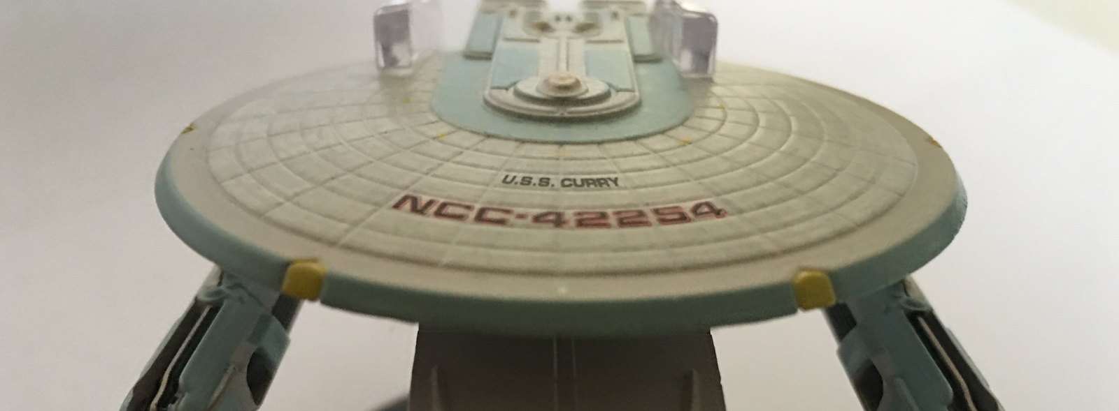
 This time it’s not from Wolf 359 but from the other big military encounter of Star Trek, the Dominion War in The shape of the Curry Class.
Featured once and only once in Deep Space Nine’s A Time to Stand pre-titles sequence, the USS Curry is another one of those oddments that fans have revelled in for years along with those Wolf 359ers.
A clear combination of Excelsior Class parts, I was fully expecting the Curry to be a letdown; a horrid matchup of leftovers slammed together just to fill a screen gap. Now in the case of the original that might well have been the case but with the Eaglemoss replica there feels to be something more to this one the second you pull her out of the box.
Just getting your hands around this one there’s an immediate sense that the Curry has been well-constructed. It feels solid, it looks detailed and not the hitch-potch it could have been. For starters the reconstituted Excelsior saucer section is a solid metal circle and you can appreciate how much more this model ‘gives’ in regards to detail as opposed to the very small scale Excelsior and Enterprise-B. That upper hull carries a rather gorgeous weathered aztec paint scheme coupling an off-white base colour with a mottled grey which adds depth to the hull.
 The paint isn’t over-applied either as we have seen on multiple occasions where the panel lines have been almost lost under layers of grey. We also get to have a really close look at the impulse engine block to the rear of the saucer and the very impressive two-blue finish Eaglemoss have managed to work on here. The precision panelling is spot on with each piece defined by the tone on top of that base off-white coat.
The raised detail is fantastic and I definitely recommend a quick compare of how well this scale has worked for the Curry as opposed to the same tiny and over cluttered section on the Excelsior. Eaglemoss even manages to work a third colour, gold, onto the bridge dome and add to the depth successfully because it's a clean marking up.
Ok, let's drop down slightly because the metal dome of the saucer also extends down onto the warp engine pylons. Good shout there because it adds to the overall strength of the ship and you can never have too much metalwork when it comes to engine attachment. The metalwork does end with the standard middle plastic insert into the underside of the saucer that connects the primary hull to the modified Excelsior Class Engineering section.
 Again the scale here allows a much clearer analysis of the fan favourite starship class first seen in The Search for Spock and you can only imagine how great the XL version of the Enterprise-B will be. The hull plating is stunning, azteced and with a ton of colour and easter eggs to boot.
The secondary hull is connected by the chunky Excelsior Class neck but a close look and you'll spot a reconditioned half a hull from a Type 6 shuttle chucked in there as a greeble. cool move and it's mirrored on the underside of the secondary hull to the back with another butchered shuttle but hold that thought.
The fact that we have this recreated is amazing - it shows the attention to detail that Eaglemoss have gone to that even a really well hidden feature such as this is there to see. The upper part of the hull is again superbly finished with that familiar grey sectioned paint scheme in evidence but with the noticable difference of the shuttlebay being switched to the front rather than the rear. It also has the addition of the Starfleet delta emblem riding on the nose which wasn't evident in the distance shot from A Time to Stand thanks to the severe battle damage the ship had incurred. This model in comparison means that we get a complete vision of the "mint" version of this Frankenstein starship rather than the battered version we saw limping from battle.
 The challenge with the secondary hull is that the placement of it - quite centrally under the saucer - means that the top detail is only just visible in the right light and up close. Flip over again and take a look at the rest of the hull. Marked up with the usual Starfleet pennants to both port and starboard, the deltas point the same way to the front and in the font you can make out the ship name and United Federation of Planets but it's hard to see even at this level. For once it's great to have a deflector that is accurately painted. It's a good, clean circle set slightly back from the lower edge of the recess with a lovely smooth finish wrapped around it. Here's one to check out on the bottom - those two red stripes are actually raised hull features and not just decals which I suspected before running a finger nail over them. They're actually raised and painted!
One more thing here is the quality of the finish on the deflector and the recess. It's just on more point as to why the Excelsior Class ships should have been just that bit bigger.
That underside on the secondary hull is awash with features. Immediately the unusual curvature of the hull draws you in and then back to the rear where the photon torpedo tubes are still evident but there's also, slapped right between them, another cut up shuttle section. Good reuse of materials and quite unexpected but that's some of the beauty of these replicas is that they contain the errors, the mini jokes and the outside-box-thinking that was all part of life on Star Trek when it came to building real, physical starship models. The inclusion of these two different shuttles is genius and for Eaglemoss to honour that is brilliant - it truly is trying to bring these to life in their most realistic form possible.
The stand positioning is decent with the Curry, with the clip sliding firmly over and under the saucer in that familiar position it seems 98% of Federation ships seem to have. No problems with this one keeping its place on the stand.
 Finally the Curry is tipped with two warp engines. There's no translucent sections on these and the warp field grilles are opaque. In contrast to the rest of the ship these two propulsion units are from the older Miranda Class starships (ie USS Reliant, USS Saratoga...) but are in their largest reproduced form to date. The detailing is slick with the backs marked up with the ship registry. Also there's a lot of blue highlights on these engines and when you spot this it draws your attention to the colouring that's to the rear of the main hull and the paintwork at the back of the saucer. Must be one of the more brightly detailed Federation ships in t\his respect. Only minor gripe is the join lines around the engines are very visible and there were a few gaps around the edges on mine which were very noticeable when you look from the bottom.
Frankly though this is a magnificent kitbash and I'd say it's one of the best, certainly a better result than the lovely Centaur Class we've already had. The inclusion of these kitbashes is a brave move but it means we are getting to see some of the more weird and wonderful ship designs from the last 30 years of the franchise.
The magazine offers up the full backstory and reasoning as to why the Curry Class looks like it does and how it came about. Being from Deep Space Nine it allows the narrative in the ship profile to cover the events of the Dominion War and the part that the Curry played in at least one encounter.
The stand positioning is decent with the Curry, with the clip sliding firmly over and under the saucer in that familiar position it seems 98% of Federation ships seem to have. No problems with this one keeping its place on the stand.

Frankly though this is a magnificent kitbash and I'd say it's one of the best, certainly a better result than the lovely Centaur Class we've already had. The inclusion of these kitbashes is a brave move but it means we are getting to see some of the more weird and wonderful ship designs from the last 30 years of the franchise.
The magazine offers up the full backstory and reasoning as to why the Curry Class looks like it does and how it came about. Being from Deep Space Nine it allows the narrative in the ship profile to cover the events of the Dominion War and the part that the Curry played in at least one encounter.
The CG images are wonderful with the plan views in particular emphasising the mottled paintwork on the hull as well as the multiple colour shades that are in play.
The creation of the USS Curry model is well documented and it's a pleasure to see a ton of images of the finished, onscreen, starship replete with its extensive scarring and damage. The speed that Dan Curry came up with the design is incredible and this double page just covers off the details of that lightning quick process from concept to screen.
 Closing out the issue is, in fact, a whole section dedicated to the starship;s namesake and the work he put into Star trek be it as an occasional director, the creator of the mek'leth and bat'leth or one of the original team that worked on creating the effects for The Next Generation, Dan Curry has had a huge impact on the look and feel of the 24th and 22nd Centuries of the franchise and this article goes some way to show exactly what impact that was.
Second up for this delivery is the Ferengi Starship from Acquisition in Enterprise's first season. Only the second Ferengi ship in the collection with the first being the Marauder back in issue 16 (102 issues ago!!!). I suspect the next time we see these guys will be the shuttle from Little Green Men and The Price.
I wasn't waiting eagerly for this one yet, as with most of the Enterprise entries it doesn't disappoint on the quality.
 The overall golden brown paint scheme is a distant shot from the sandy brown of the Marauder but the metallic finish is spectacular especially plastered across the metal top section of the ship. It sparkles away nicely but don't get caught up in the funky paint because the hull has more to reveal.
Afterall, there's that distinctive scarab beetle shape to the ship with the plating resting on each other in the same way as shell armour does on such a creature. It's a simple organic shape and given the single colour across the whole of that top surface, it needs something to give it some life and raise the interest. Fortunately it does and the metal surface works splendidly, giving rise to a rather intense collection of panel lines and surface features from front to back and side to side.
Right from the angular pincers at the front there's an overload of crisp etched markings across the top and over all of the varied structures that appear on the hull. About half way along on either side is a docking port with a golden hued hatch offering a quick way out or passage onto another craft to pillage. Even these have tiny hatch detailing on them which really surprised me when you think of all the things that Eaglemoss haven't marked correctly that would have been easier to do.
 Y'see it bugs me that I love this ship not for the overall design, shape and feel but for the actual attention to detail that oozes from every millimetre of its hull. To the back of the smooth and sleek shape is the engine block which is highlighted with a touch of gold and stands out only slightly from the sandy (and still quite golden) main hull colour.
The top of the ship is a glowing advert for quick, sharp and futuristic tech but it's on the bottom that the Ferengi ship that everything really comes to life. That flat underside reminds me of how I used to draw spaceships at the age of five or six but while it is a very sharp edge and odd for a Star Trek craft to have a flat underside, check out all the detail that John Eaves managed to fire at her.
For a start there are the six distinctive landing legs which fold away underneath. Even the nuances on these feet are amazing - just squint closely and look at the panel lines on each of them, the recess around each of them which gives the feet that retracted depth and even the central tiny markings and alternate colour which stand each of them out against the hull.
But just look at the work on this underside. Every millimetre carries some form of differentiation to the next millimetre and it's as though we have a ship of two very distinct halves; a serene upper hull and a belly that hides away all the workings and gubbins - very swanlike in its design and by that I mean graceful on the surface and paddling like f**k under the water. Somehow this one has managed to pull at my starship heart-strings and I kinda like it.
Centrally and protruding from the flat underside is what can only be described as a radar dish. Even that has some classy little finishing touches and you can't help yourself but love what's been done here. It actually puts some of the other ships to shame once you stop and take stock of what has been achieved on what should - and could - have been a mind-numbingly bland entry to the collection. I mean, come on, adding this in mid 110's isn't pushing it as a star attraction is it?
But *sigh* once again, a ship from Enterprise has delivered and it hurts to say it but it's a visual masterpiece in regards to both the metal and plastic detail. The underside's more flimsy construction material suits the larger amount of ups and downs that the jigsaw feel of the floor gives off while the metal topside is perfect for the elegant curves of this Ferengi craft. It actually makes me want to see the shuttle even sooner because it's so ridiculously beautiful. I just can't stick it anywhere near the Vidiian or Kazon ships because this paintwork makes those two look particularly bad and I can guarantee it ain't sitting on the same shelf as the Malon freighter.
The stand arrangement goes for a normal rear grip over the engines and between the two raised shoulder sections to the back but what did give me a head-scratch moment is the height that the ship stands at when in place - it's very, very high given the slimline nature of the Ferengi Starship.
 The magazine doesn't disappoint either because there's a full background on the ship and just how it was operated as well as how the internal space was divided up - let's say there's a lot of room for cargo in here.
John Eaves was once again called on to come up with this design and it was one of three that he initially proposed with some clear parallels to the 24th Century The Next Generation craft that we might be more familiar with.
More unusually we have an in depth interview with the four actors who played the Ferengi in the first season episode which included three people who had previously worked in Star Trek namely Ethan Phillips, Jeffery Combs and Clint Howard plus newcomer Matt Malloy. It's a damn good read covering the making of the episode from the actors perspective and while there are mentions of other appearances in other series, the article remains nicely focused on the Enterprise story.
February will bring us the Freedom Class from Wolf 359's graveyard and the Hirogen Holoship from Flesh and Blood in Voyager's seventh season.

Second up for this delivery is the Ferengi Starship from Acquisition in Enterprise's first season. Only the second Ferengi ship in the collection with the first being the Marauder back in issue 16 (102 issues ago!!!). I suspect the next time we see these guys will be the shuttle from Little Green Men and The Price.
I wasn't waiting eagerly for this one yet, as with most of the Enterprise entries it doesn't disappoint on the quality.
 The overall golden brown paint scheme is a distant shot from the sandy brown of the Marauder but the metallic finish is spectacular especially plastered across the metal top section of the ship. It sparkles away nicely but don't get caught up in the funky paint because the hull has more to reveal.
 Afterall, there's that distinctive scarab beetle shape to the ship with the plating resting on each other in the same way as shell armour does on such a creature. It's a simple organic shape and given the single colour across the whole of that top surface, it needs something to give it some life and raise the interest. Fortunately it does and the metal surface works splendidly, giving rise to a rather intense collection of panel lines and surface features from front to back and side to side.
Right from the angular pincers at the front there's an overload of crisp etched markings across the top and over all of the varied structures that appear on the hull. About half way along on either side is a docking port with a golden hued hatch offering a quick way out or passage onto another craft to pillage. Even these have tiny hatch detailing on them which really surprised me when you think of all the things that Eaglemoss haven't marked correctly that would have been easier to do.
 Y'see it bugs me that I love this ship not for the overall design, shape and feel but for the actual attention to detail that oozes from every millimetre of its hull. To the back of the smooth and sleek shape is the engine block which is highlighted with a touch of gold and stands out only slightly from the sandy (and still quite golden) main hull colour.
The top of the ship is a glowing advert for quick, sharp and futuristic tech but it's on the bottom that the Ferengi ship that everything really comes to life. That flat underside reminds me of how I used to draw spaceships at the age of five or six but while it is a very sharp edge and odd for a Star Trek craft to have a flat underside, check out all the detail that John Eaves managed to fire at her.
For a start there are the six distinctive landing legs which fold away underneath. Even the nuances on these feet are amazing - just squint closely and look at the panel lines on each of them, the recess around each of them which gives the feet that retracted depth and even the central tiny markings and alternate colour which stand each of them out against the hull.
But just look at the work on this underside. Every millimetre carries some form of differentiation to the next millimetre and it's as though we have a ship of two very distinct halves; a serene upper hull and a belly that hides away all the workings and gubbins - very swanlike in its design and by that I mean graceful on the surface and paddling like f**k under the water. Somehow this one has managed to pull at my starship heart-strings and I kinda like it.
Centrally and protruding from the flat underside is what can only be described as a radar dish. Even that has some classy little finishing touches and you can't help yourself but love what's been done here. It actually puts some of the other ships to shame once you stop and take stock of what has been achieved on what should - and could - have been a mind-numbingly bland entry to the collection. I mean, come on, adding this in mid 110's isn't pushing it as a star attraction is it?
But *sigh* once again, a ship from Enterprise has delivered and it hurts to say it but it's a visual masterpiece in regards to both the metal and plastic detail. The underside's more flimsy construction material suits the larger amount of ups and downs that the jigsaw feel of the floor gives off while the metal topside is perfect for the elegant curves of this Ferengi craft. It actually makes me want to see the shuttle even sooner because it's so ridiculously beautiful. I just can't stick it anywhere near the Vidiian or Kazon ships because this paintwork makes those two look particularly bad and I can guarantee it ain't sitting on the same shelf as the Malon freighter.
The stand arrangement goes for a normal rear grip over the engines and between the two raised shoulder sections to the back but what did give me a head-scratch moment is the height that the ship stands at when in place - it's very, very high given the slimline nature of the Ferengi Starship.

John Eaves was once again called on to come up with this design and it was one of three that he initially proposed with some clear parallels to the 24th Century The Next Generation craft that we might be more familiar with.
More unusually we have an in depth interview with the four actors who played the Ferengi in the first season episode which included three people who had previously worked in Star Trek namely Ethan Phillips, Jeffery Combs and Clint Howard plus newcomer Matt Malloy. It's a damn good read covering the making of the episode from the actors perspective and while there are mentions of other appearances in other series, the article remains nicely focused on the Enterprise story.
February will bring us the Freedom Class from Wolf 359's graveyard and the Hirogen Holoship from Flesh and Blood in Voyager's seventh season.
Follow us on Twitter
+1 us on Google+
Add us on Tumblr
No comments:
Post a Comment