
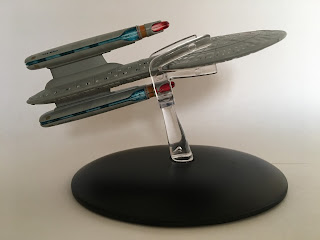
A fourth new arrival from the seminal battle of Wolf 359 has joined the series with the USS Buran.
A twin-nacelled Challenger Class starship, the Buran is named after the Russian version of the space shuttle and, now that we know Lorca’s previous command in Discovery, is one of two ships to have borne the name.
The similarities to the other Wolf 359 wrecks as well as the Galaxy and Nebula classes are striking from the very front curve of the primary hull. Namely because all the screen-fill wreckage was cobbled together from model kits and available bits.
 The Challenger Class is the smallest of the Wolf 359 ships to be featured both in the show and as a model as well as being one of the smallest Federation craft to grace the series.
Oddly for me this feels less detailed than the others from the fleet probably because of that size variation and partially because there’s not a lot to this one when you compare to the three already available. The saucer carries the major panel lines spreading from,the central bridge module as well as the painted on windows which avoid the trademark Eaglemoss misalignment thank goodness.
The Challenger Class is the smallest of the Wolf 359 ships to be featured both in the show and as a model as well as being one of the smallest Federation craft to grace the series.
Oddly for me this feels less detailed than the others from the fleet probably because of that size variation and partially because there’s not a lot to this one when you compare to the three already available. The saucer carries the major panel lines spreading from,the central bridge module as well as the painted on windows which avoid the trademark Eaglemoss misalignment thank goodness.
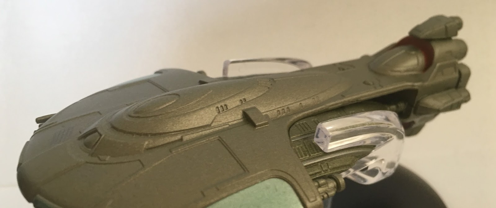
The phaser bank too is highlighted in a darker grey than the main hull allowing all the essential elements to be distinguished easily. Thing is that with the distinct registry and name, the lifeboat hatches don't stand out at all, they appear more as slightly raised hull plating. If you do do,take a step,back the lighter colour contrast of the square hatches is more apparent and you can see the difference just in the pictures ive taken here.
That saucer upper part is the standard metal element of the build in the Challenger Class. The underside centre section of the saucer and everything backwards is in plastic of some description.
 Step back from the saucer and we have the secondary hull moulded straight into the back of it. Here that trademark grey paint scheme continues without missing a beat. There are more distinct panelling lines and windows again painted on rather than being lined up with hull recesses. Then protruding up and down from the rear are the two warp nacelles attached via two very chunky pylons. While there are other ships with vertically paired engines this is the only starship where 1) there are just two warp engines and 2) they are unusually - and purposely - misaligned with the top one being set back slightly over its lower twin.
The warp engines do feature translucent blue engine grilles and crimson bussard collectors to give that more realistic feel to the ship and with this affording the larger scale it is something that could not be avoided; painting them on would have looked shoddy. The one thing that is missing from the back though - and in the magazine - is the tiny registry across the very narrow rear edge. Very small space, not easy to detail. I get it and at least the phaser strips are in place.
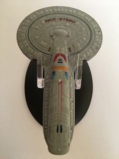
Flip this one over and for a second you're not sure if it's the same on both sides but fear not, the belly of the ship is instantly distinguishable with the rows of escape pods littering the sides of the pill-shaped secondary hull and also across a good proportion of the saucer. You can just make out that inlaid plastic section which is boundaried by the ventral phaser bank and the ship name is omitted with only the NCC- number in place as per most (if not all) Starfleet ships.
Note too the smoothing off of what would have been the Captain's Yacht on the Enterprise-D right at the centre of the saucer. In fact if you look even more closely you can see that this is actually two upper hull sections from that ship glued together for the Buran as the elliptical frame around the yacht space is only on the top of a Galaxy Class saucer. Great reuse again!
Flip this one over and for a second you're not sure if it's the same on both sides but fear not, the belly of the ship is instantly distinguishable with the rows of escape pods littering the sides of the pill-shaped secondary hull and also across a good proportion of the saucer. You can just make out that inlaid plastic section which is boundaried by the ventral phaser bank and the ship name is omitted with only the NCC- number in place as per most (if not all) Starfleet ships.

Note too the smoothing off of what would have been the Captain's Yacht on the Enterprise-D right at the centre of the saucer. In fact if you look even more closely you can see that this is actually two upper hull sections from that ship glued together for the Buran as the elliptical frame around the yacht space is only on the top of a Galaxy Class saucer. Great reuse again!
The slim, vertical construction of the Buran makes for a unique silhouette but of the ships from Wolf 359 this does feel like the least inspired design and certainly the one with the least parts to really get your teeth into. What it does have is some nice decalling especially when it comes to some tiny finishing touches at the back end. It’s not the prettiest of ships either and you can tell more than any other that this was designed as something that would only ever be in the background. Oddly it managed this feat twice with a second appearance in Unification’s starship graveyard.
The magazine skims across some very sketchy background, tending to focus more on the events of Wolf 359 coupled with a few facts and figures around this small Federation ship.
 Backing this up we have a fantastic trawl back through the Borg Timeline taking us over the key moments from the series' encounters with the cybernetic lifeforms in chronological order rather than episode order so we start off with First Contact in the 21st Century and run through to Endgame and Voyager. It's a different way to do things and helps place events in a new way especially when you drop in the events from Enterprise's Regeneration.
Continuing the season four themes that have been appearing in recent issues covering the Wolf 359 ships, this edition takes us into the makeup world and Michael Westmore recounting the creation of Noonien Soong, Gowron's unique Klingon forehead, the Cardassians and even the blue-skinned Bolians. Whether intentionally or not, the collection has given us a wonderful overview of one of Star Trek's most successful and well-written seasons.
Second out of the stable this month is the Tellarite Warship. I’ll be honest, it took me a good couple of days to get this out of the box due to all the seasonal festivities yet I knew it would be quality since it’s from the Enterprise fold. These inclusions to the collection rarely disappoint since they were CG created from day one and it seems Eaglemoss are working directly from those images to create their replicas.

Offering up a rather aquatic aesthetic, the warship comes in a metallic green with only a couple of light green and red highlights giving a second colour to the model. It's also a model where the metal sections themselves are hidden "deep" within the main structure. The whole outer casing here is plastic with an inlaid section between the nose and the tail being the only metal piece present.
For an Enterprise ship this one has very distinctive panelling across the whole ship with that crescent-shaped forward section showing off a range of different levels of hull casing. It’s not got the intricate aztec scheme or small panel lines you find on the Buran but it’s a distinct look which relies on the contours of the craft rather than multiple colours to give it depth and form.
 To the front there are two groups of antennas formed in plastic and a decent thickness which means they shouldn’t suffer collision damage if the worst happens. Unusually there’s a good bit of detail going on around the leading edge with further recessed details and also features highlighted in that lighter green colour. That colour is also present in the two crescent-edge formations giving some variety to the metallic green overcoat. Now to be fair these could have done with being translucent to give a stronger feeling of the mechanics of the ship as the cover and the plan views show there are some form of bussard collector evident inside them. Also those exhaust ports to the rear of the engine crescents just look a bit unwieldy. As we’ll see it’s almost as if they worked on this one from the back to the front and kinda got bored along the way.
If we look closely at this one, the form of the Warship is actually quite clever because from behind that raised bridge section it tapers back to the significant engine block but not before we have a section where the middle of the craft has open space within its frame.
 This has to be one of the few - if only - occasions where this has been achieved and I would think it’s a lot easier than it looks on the model. It appears therefore that the metal section which is buried in the middle of this is there more as a structural support rather than an afterthought of where the metal pieces could go. It makes total sense to drop in here as I suspect a complete plastic ship especially in this central area would be very flimsy.
Ok, let’s follow the slender top section to the rear and the vertically stacked engine block.
There’s a hint of colour here both on top and below with a red highlight indicating (maybe) a form of bussard collector set back into the frame. It’s also here that the Warship seems to contain most of the detailed elements of the design. That vertical engine is unique but doesn’t set the whole design alight. The detail is good but a final few greebles at the back end aren’t enough to save what is a very average ship design.
The stand clip fits right around the rear of that semi-circular main hull giving a central balance to the ship and an even keel for display. Nice and steady with this one and no tipping concerns.
Into the magazine for a bit now and it’s an alright read but, because the ship isn’t one of the stellar collection attractions it doesn’t make this a must-read.
 The background of the warship suggests that some of the elements within the vessel would be later absorbed into the designs of future Federation craft. It also covers the events of the the Romulan arc from the fourth season of Enterprise in which the Tellarites played a part alongside their Andorian nemeses.
Cleverly the third section here, after some rather good plan views which (as noted) highlight a few shortcomings of the model's construction at the front end, opens up the tetchy subject of Tellarite appearances. It's a title that covers a multitude of sins for sure.
In between these two articles we actually have something relevant to the ship. The designing section covers four pages and reveals that the Tellarite ship began life in season one of Enterprise as something completely different in a quick appearance before being resurrected for more screen time three years later. The sketches and concepts for the ship are as interesting as ever with Eaves' ship being one of the rare occasions where they utilised CG to allow for the open spacing, something that hadn't really been explored in that format before.
Exploring the terrible attempt from Journey to Babel, the more suitable reworking for Whom Gods Destroy through to the fleeting appearances during the movies before reappearing fully realised if you will during the Star Trek prequel series. Not only does this discuss the makeup of the Tellerites but also how these aliens were written and how they evolved over the course of the franchise's TV history. It's a good solid read because these guys received such little airtime but there was still a great amount of development put into their background.
Ok, overall these two are a steady pair to induct into the Starships Collection. These "scene fillers" as you could call them does really push home that the series is now getting into serious completist territory with most, if not all of the series most recognisable ships ticked off the list. Of the two the Buran is easily the better product in my eyes because of its place within the Wolf 359 set although it could have done with being a shade bigger.
Next month's Curry Class from Deep Space Nine and Ferengi Cruiser from Enterprise continue this trend of kit-bashers and one-ep wonders. Hoping that prequel entry is back up to the usual standards!
Buran or Tellarite? What's your call on this time's ships?
Follow us on Twitter
+1 us on Google+
Add us on Tumblr
No comments:
Post a Comment