

One of the most fascinating periods of Star Trek history has to be the late 1970's.
A time when the wonders of Star Wars were a major factor in changing the course of Star Trek and pushing it into the cinema and away from the medium of TV until 1986.

Eaglemoss now presents the USS Enterprise that almost, nearly but ultimately never was as part of their bonus editions range from The Official Starships Collection.
Now, who isn’t a sucker for an Enterprise huh? Precisely and with this one it’s a real mish-mash of the classic TV craft and it’s refitted movie version but let’s start at the top and take this one a step at a time.
Overall the distinctive shape of the Constitution Class remains the same - saucer, secondary hull and warp engines but it’s the tweaks that Matt Jefferies put into the ship that make it all the more interesting especially when you compare it to what was in the series and what would be in The Motion Picture.
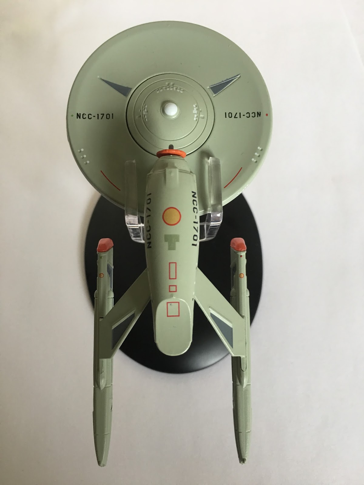
 For starters, the saucer panel lines make their first appearance after the smooth finish of the TV series model however the registry remains in the classic font of the show rather than adding the block font and red edging. Nor are the phaser bank emplacements blocked in as they would be for the film. At the centre, the bridge module is instantly recognisable but finally has a second turbo lift tube added, giving the unit those Mickey Mouse ears. Aside from that though, the bridge piece is identical to its previous incarnation.
Also added is a double red stripe that runs from the rear of the bridge module to the back of the saucer and then down the length of the secondary hull to the top of the shuttlebay. It’s actually something that appears on neither the movie or TV series version - and there are a couple more bits like that to come.
The saucer is of course metal for the most part with the central underside section in plastic and connected to the neck and then the Engineering hull.

Ok. The neck itself is standard refit movie fayre however instead of the double torpedo tune just above the main deflector we have just a single outlet for the powered projectiles. Nor is it painted up, leaving us with an uncoloured weapon port. In fact the neck piece disappoints further with some horribly misaligned windows on both sides. Surprise, surprise.
 Down onto the secondary hull and there is a major change in the way in which this has been put together. You will recall from the A and the movie refit editions that the front of the ship had a gaping curved join line from top to bottom. This time that’s been avoided with the top and bottom halves of the hull coming together along a clean and well concealed central point.
The colour scheme across the whole ship is more in line with the single tone grey of the underwhelming movie refit model from issue two and there’s not even a slight hint of our favourite aztecing to take the edge off. Luckily though the Engineering section is emblazoned with not just the Starfleet pennant on either side but a larger than life ship registry. This is highly irregular and I can’t think of another ship where this happens.
To the front we have an obvious hark back to the classic style of the Enterprise with the golden coloured external deflector dish. It looks rather odd given the other upgrades across the ship especially alongside those more oblong nacelles thrusting our at the back. It does however seem to be better finished and painted than the one on The Original Series’ model which was a touch more orange.
 On the underside of the hull the red and yellow detailing is very similar to that on the movie starship and adds more to breakup the standard grey colour tone. It really has no practical purpose and acts more to ease the eye across the plain hull.
Stepping back along the grey Phase II hull, we find ourselves at the most significant of the physical changes to the Enterprise with the straight, right-angle to body pylons replaced by two sweeping arms that give the ship a go-faster feel. Not as detailed as those on the movie version - most likely because TV is a more forgiving platform than a massive cinema screen - they are topped by the reshaped, more rectangular warp engines.
In these however there are no translucent warp field grilles but the bussard collectors are the interesting part here because they still carry the red hue from the domes of the original variant of the ship. They look quite odd on the end of this type of engine but in the same breath manage to hold on to the essence of the warp engines as seen in The Original Series.
They aren't quite as cleanly detailed as the engines on the movie version with the warp field grilles cutting off well before the end of the nacelles which also don't have the fins on the outboard sides to reduce the severity of the tapered ends.
 As with multiple other starships, the stand is very firm in its grip on the ship, holding the secondary hull in place and then gripping the rear of the saucer - and not too tightly either. Shame is that the clear plastic holder has a terrible fit into the black base.
The magazine with this one is a treasure trove of information and trounces the last edition which was produced for the Concept Enterprise-C and barely discussed the ship. Here we get to talk in-universe about the changes that "would" have taken place before stepping into the design process from Matt Jefferies who did it as a favour for Roddenberry. This is accompanied by some cool sketches of the ship and even parts of the Enterprise that were updated.
Then there's a section dedicated to the construction of the model which was found to be lacking when it came to upgrading it to The Motion Picture big screen standards and was binned off. Some good photos but a bit disappointing that the proof reader didn't spot the chunks of text left in from the Enterprise-B magazine. Duh.

This is one of the must-haves from the collection and a damn fine model even with some minor issues along the way. As a big fan of Phase II and it’s non-existence this was a no-brainer when it dropped and I don’t think you will be disappointed. The build is decent and the joins are satisfactorily lined up in logical places. Not great that the warp engines miss out on translucent grilles but it doesn’t ruin the finished product. A great opportunity to take a closer look at what could well have been if it hadn’t been for ‘mitigating’ circumstances. Now to just try and fit it in with all the other Enterprise models on that shelf...
The USS Enterprise NCC-1701 Phase II Concept is out now from Eaglemoss.
What do you think to this lost link from Star Trek?
The USS Enterprise NCC-1701 Phase II Concept is out now from Eaglemoss.
What do you think to this lost link from Star Trek?
Follow us on Twitter
+1 us on Google+
Add us on Tumblr
No comments:
Post a Comment